
Homeaid
Client
CareerFoundry course project
My Role
UI Designer
Credits
Yu-Hsuan Sharon
Chang (mentor)
September 2021-
January 2022
Timeline
Tools
Adobe XD
Illustrator
Photoshop
Skills
Information Architecture
UI Design
Interaction Design
Responsive Design
The brief
Real estate investment is an increasingly popular way for individuals to achieve financial security. It is an exciting and emotional experience, but often complicated. Design a responsive web app that provides property buyers with information on properties of interest that will provide them with the expertise needed to get started efficiently.
The problem is…
“
While there are plenty of blogs and agencies providing information about property investment, new buyers often struggle to get started without professional guidance and then waste time viewing properties that are unsuitable for them.”
“
Going into this project, steps in user research such as the creation of a Persona, Rashida, and their user stories had already been established and provided up front. The focus of this project is the UI design. The original suggested app name was ‘Perfect Properties’, which I later changed to coincide with other branding details.
As someone with a personal keen interest in property design, and little knowledge of property investment, I was excited to explore the combination of both areas.
I believe sustainability is becoming an even more discussed factor when it comes to property investment, and my idea was to match the persona of Rashida with an app that is tailored to being more environmentally conscious.
The background
The flow
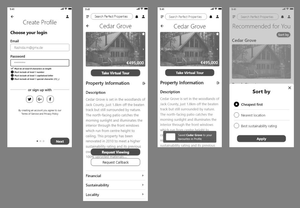
Rashida’s user stories formed the basis for drawing a user flow diagram, which could consider her three main requirements when taking steps in the app. This was then translated into low fidelity wireframes for mobile.


The look
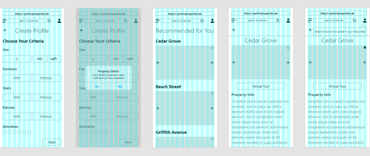
With the bones of the design now in place, gridlines, spacing, visual hierarchy, UI elements and design patterns were refined and applied to optimise the transition from low-fidelity wireframes to mid-fidelity wireframes.
-
![]()
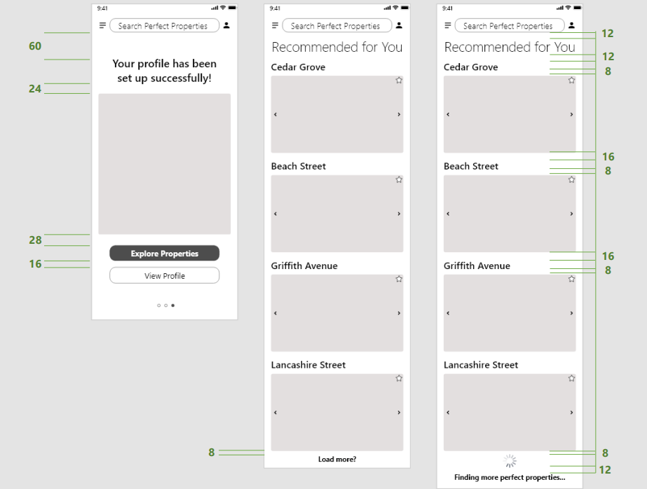
Gridlines
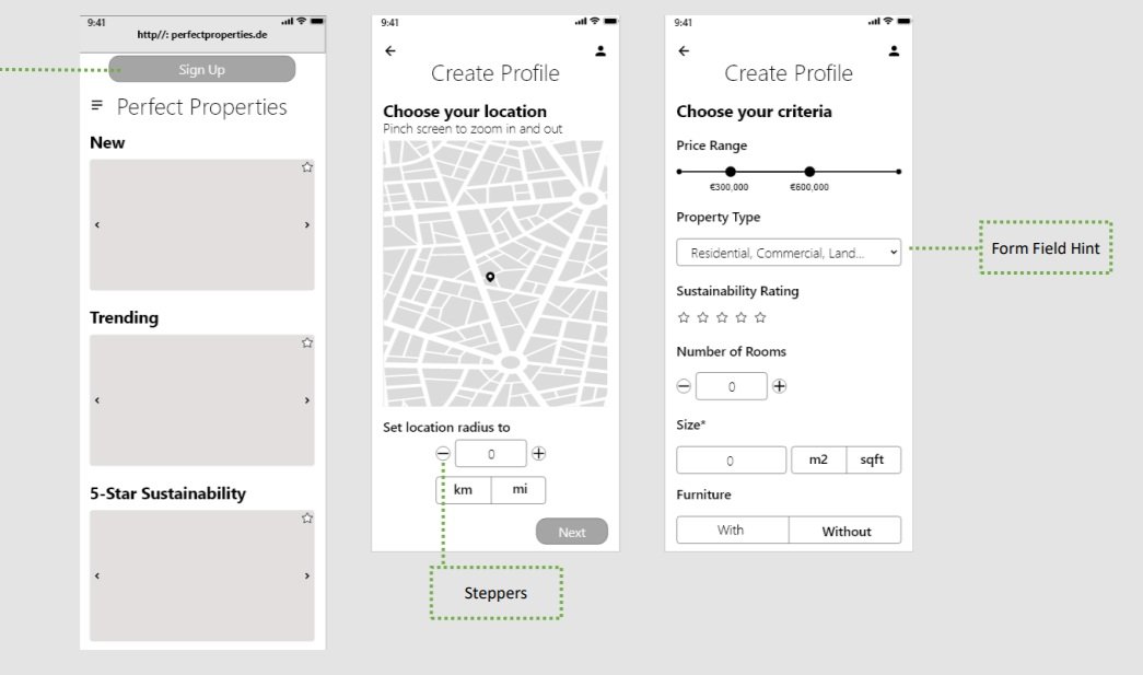
I decided to go with 12 columns in this step, to support the intended level of detail and sizing of elements and to allow scalability for future design.
-
![]()
Visual Hierarchy & Spacing
Equal spacing between labels and cards were applied to give the look more consistency. CTAs were coloured a darker shade for more clear visual hierarchy, and text was bolded to inform the user more easily about separate sections.
-
![]()
UI Elements
UI elements were defined and were systematically applied across all screens.
-
![]()
UI Design Patterns
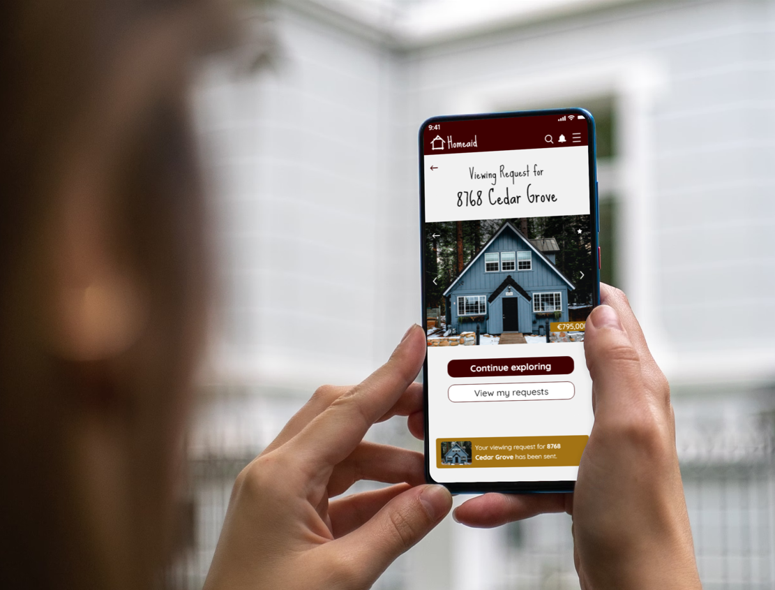
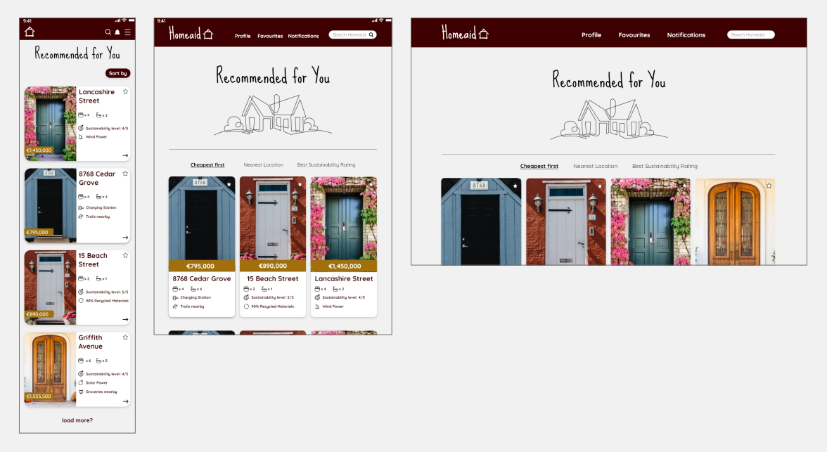
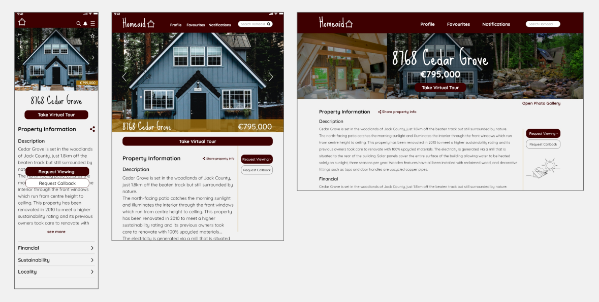
Several measures were taken to improve the UI design patterns that users would be familiar with so that the experience was more intuitive. These included the design of the notification process. An icon was added beside the profile icon, and a snackbar would now appear and fade away once a property was saved, demonstrating patterns of feedback and like & upvote. Sorting chips, floating action buttons, overlays, and hints were also implemented for better ease of use.
The mood
When considering the appropriate mood for this project, I wanted to really incorporate the feeling of sustainability as an added touch to match the noted property features such as upcycled materials, sustainable energy sources etc. The persona, Rashida, is a very modern, tech savvy, family person who enjoys the countryside. So it seemed fitting that sustainability factors would be important for her property search. She needs to find somewhere that is beyond the city to suit her personal lifestyle away from work life, and meets her expectations in terms of efficiency and smart design. This led me to creating two mood options for review.

Using the original brief’s suggested colours of greens, blues, and purples, I combined these with a more slick, metallic, industrial style that Rashida could resonate with from city life.
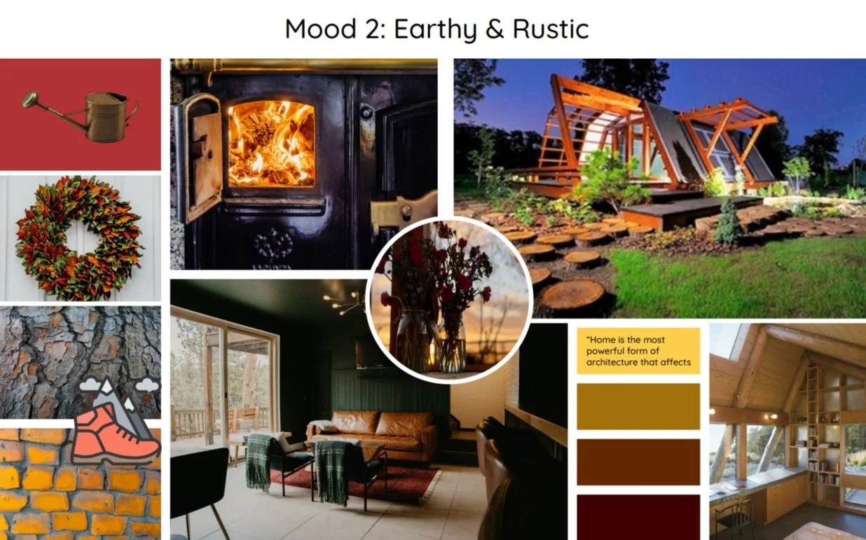
Imagining a more natural and rugged vibe, I introduced an alternative style that is more in tone with living in the countryside, that can still remain current and modern.
To make the decision, I tried putting myself in the shoes of the persona, Rashida and consider her character and goals. In the end, I found it tricky to make an obvious choice, but felt that Mood 2 would more closely represent Rashida's desires to escape city life.
The
style
Quicksand is the main font for all other elements of the app. It uses geometric shapes and was designed for display purposes but kept legible enough to use in small sizes as well. This is optimal for when the app displays smaller pop-ups etc. It is modern and more similar to what users would expect for a professional property investment app. It is also available in many weights, perfect for minimising or enhancing the emphasis of text.
Typography
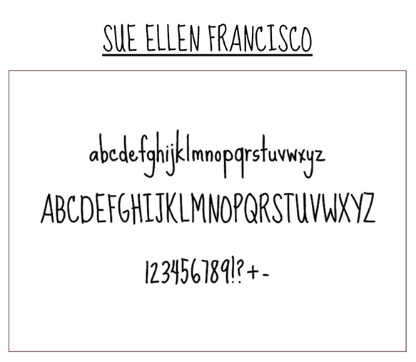
I chose to use the Google Font "Sue Ellen Francisco" for the main headings because of its loose and relaxed style. The tall skinny glyphs are more aligned with the rustic and earthy mood that is being created for the persona Rashida. It is fun, clear, and gives the app a sense of adventure.

The
scheme
Colour
Whilst I enjoyed experimenting with some of the more bright orange, yellow, and dark green colours, when I added them to wireframes, the palette that seemed to fit the best was #2. The goal was to incorporate a rusty dark red - almost brown - as the primary colour, and then compliment it with other earthy or rustic colours to come closer to the mood established. I felt that palette #2 succeeded the most with creating the desired colour scheme, whilst still remaining professional in appearance. Later this palette was updated to include some of #3.

The
imagery
Photography and Illustrations
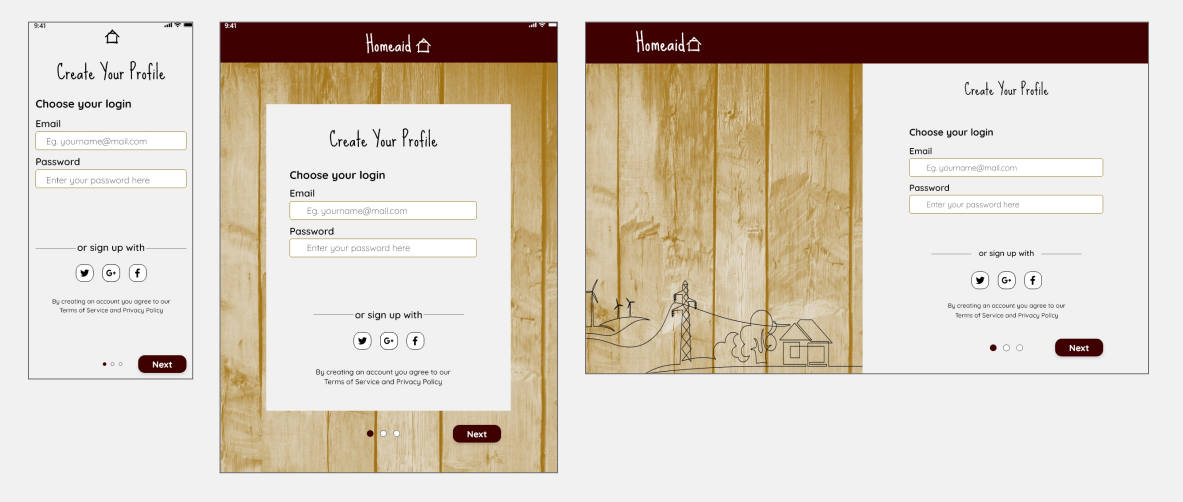
In considering the project brief, the defined mood, and the story I wanted to tell with imagery, I had an idea that simple imagery would be best. For the main hero image attached to individual properties, the display would be a door frame, which when navigated with would then display images of the entire house. My train of thought was that the front door of a house can offer a lasting first impression of how a house will be overall, and literally opens the door to new exciting, possibilities. By using simple imagery like this, the users are presented with a unique experience, perhaps different to other property sites, feeling also less cluttered. It will keep a rustic and earthy theme this way in having a close-up image of the main front door of a property. A textured wood pattern is also used on the app introduction screens to represent a door. Additionally there would be some minimal illustrations used sparingly in specific circumstances. These are outline illustrations that can give the app a sense of professionalism, playfulness, and earthiness at the same time and are aligned with the idea of sustainability.


The
symbols
Iconography
Icons are minimal line style, with rounded corners and edges. The app logo uses the Header text font Sue Ellen Francisco. The icon used follows the mood of rustic, earthy, and minimal line style, matching the other loose illustrations within the app. The logo appears upon first opening Homeaid, and the icon continues to be displayed during the signup/onboarding process.

The interactions

Focussing in on gestures, interactions, and animations between screens helped to inform how the final UI and prototype would be presented.
Try the interactive prototype here!

The breakpoints
One of the final steps for the project was designing for different breakpoints to support responsive design. Wireframes to represent the three user stories were drawn up and iterated to produce high-fidelity UI mockups for tablet and desktop screens.
The Learnings
About the assets
It can be tempting not to label assets and hard sometimes to keep files organised as you go, especially when time is of the essence or you’re on a roll with design ideas. Coming towards the end of this project, i regretted not having a habit of labelling all along, as I was then required to compile a design handoff package so that developers could translate my designs. This was a real learning curve.
About the impact
Whilst the Homeaid project is based on a fictional scenario, and therefore has not had real-life impact to others, working through it has made a real-life impact to my own personal search for an investment property. Being at a specific stage of life and surrounded by many acquaintances also property-hunting, Homeaid has made me seek out the finer details that would make me personally more happy as a sustainable homebuyer and a user of such resources as Homeaid. Factors such as the extra touches in interactive design, which I thoroughly enjoyed experimenting with, are often missing from the typical homebuying sites. I notice it’s not there, and I miss that experience, so I lose interest more quickly.