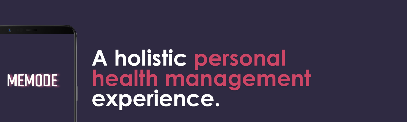
memode
Client
CareerFoundry course project
My Role
UX Researcher
UX Designer
UI Designer
Credits
Mark Kremer (mentor)
Timeline
March-August 2021
Tools
Balsamiq
Adobe XD
Miro
Lucidchart
Google Forms
Optimal Sort
Helio
Zoom
Pen&Paper
Skills
Competitor analysis
Data analytics
User interviews
User personas
User journeys
Information architecture
Usability testing
Wireframing
Prototyping
The brief
Based on the user-centred design process and considering design thinking, design an app to allow health-conscious individuals to log in to a responsive health and wellbeing portal to record their health and medical information, and access general physical and mental wellbeing features. The design must include education for the user, privacy, and inclusivity. The app should help users to organise their lifestyle, prioritise their health needs, enjoy the process, and minimise life’s inherent pressures from hijacking their progress.
Our health-conscious users need a way to access relevant and engaging health and wellness information, on a platform where they can combine their own personal details securely, because the amount of resources available is overwhelming and it is difficult to understand how to summarise and put into practice an effective healthy lifestyle plan.
The problem is…
“
“
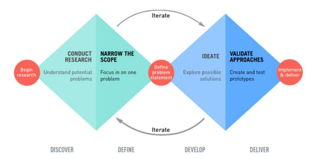
The road to discovery
-
![]()
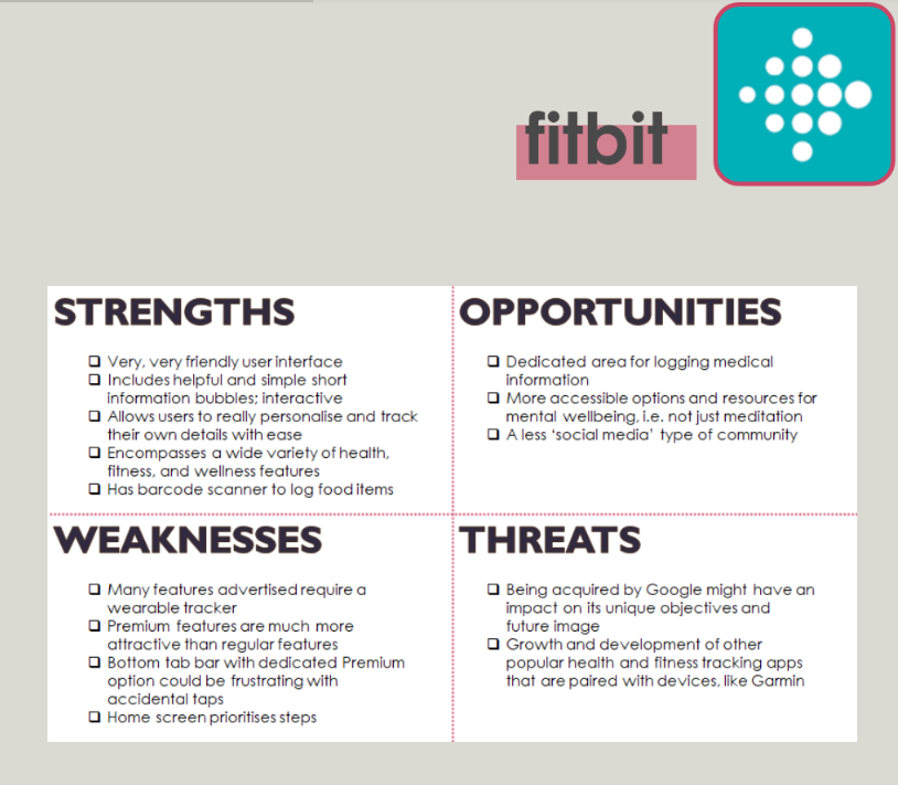
1. Competitor Analysis
The next step was to conduct Competitor Analysis on apps that offered a similar solution to my proposed solution. The research was boiled down to analysing MyTherapy and fitbit in terms of tracking medication, measuring progress of fitness, and accessing useful resources. I initially focussed on three core aspects - key objectives, overall strategy, market advantage - and used these observations as a base to carry out a SWOT analysis of each profile. Later I conducted a UX-specific analysis taking into account usability, layout, navigational structure, compatibility, differentiation, and CTAs.
-
![]()
2. User & Job Stories
After defining a target audience, and weighing up the risks and opportunities now more evident since performing a competitor analysis, I created user and job stories to match the functional requirements of the proposed app in order to remain focussed on the main deliverables for users.
-
![]()
3. Surveys
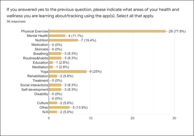
At this stage, considering a broadly defined target audience and in order to make quicker decisions on what could or couldn’t work in my app, I wanted to gather quantitative insights that would yield more accurate information to serve a more diverse and inclusive app design. This was done via a user survey with a sample size of 36 potential users. A questionnaire was prepared on Google Forms with questions about users’ current experience with health and wellness apps and what features would be most preferable and useful. The results were aggregated and the most striking insights noted.
-
![]()
4. Interviews
Next, qualitative research was used to provide a more detailed insight into a handful of potential users’ thoughts and behaviours regarding health and wellness. After preparing script, I interviewed three people from a wide demographic range, with varied interest in terms of health and wellness and varying levels of technical expertise with apps.
-
![]()
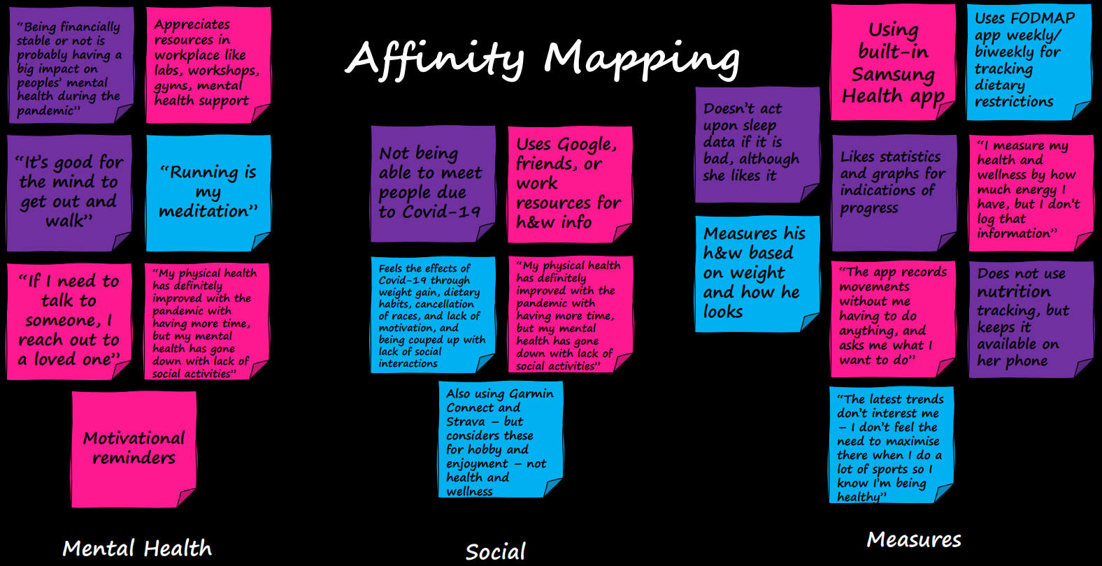
5. Affinity Mapping & Cluster Insights
By employing affinity mapping, all of the user interview findings were added to the sticky notes and compiled into 4 categories per interviewee: behaviours/attitudes, needs/goals, frustrations and quotes/facts. These were then regrouped into Cluster Insights, which highlighted common themes from one interviewee to the next. The clusters gave very clear indications as to where the priorities lie, what the most prevalent pain points are, and what features are interesting.

The verdict
86% find goalsetting helpful
22% of those surveyed are not aware of their health insurance benefits
“I would call 999 in an emergency…or is it 911…”
Less than half felt confident about what action they would take in an emergency
“My physical health has definitely improved with the pandemic, but my mental health has gone down with lack of social activities”
In the surveys when asked about aspects of health and wellness that they are learning about/tracking using a current app, not one person selected “medication” from the multiple choice selection. I used this information to probe further in interviews as to users’ opinions on having a medication section within a holistic health and wellness app.
During interviews, all participants were somewhat wary of the time it would take and felt their answers might not be relevant or useful, but it was interesting to observe how much they became more comfortable over the course of being interviewed and probed further on some of their responses.
Unfortunately, contextual enquiries were not possible for this project due to Covid-19 restrictions.
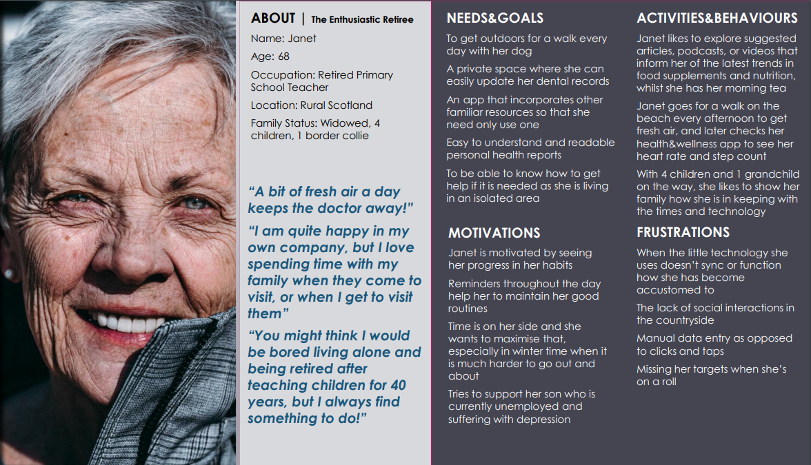
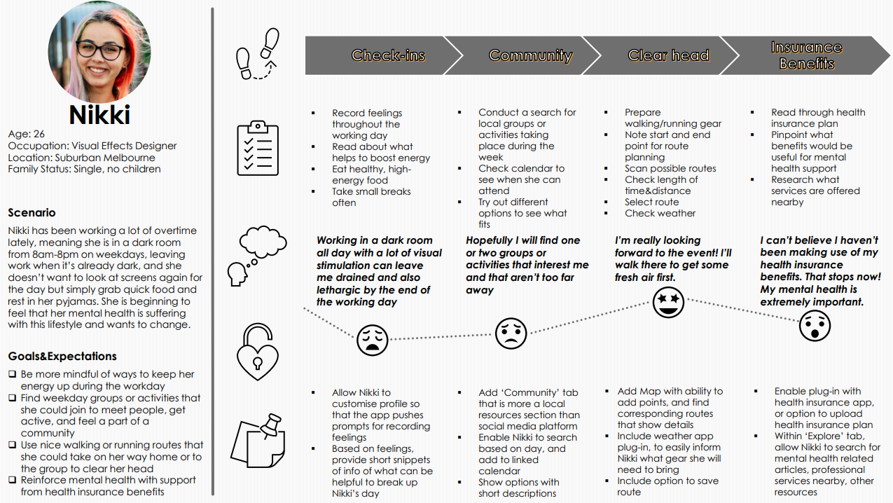
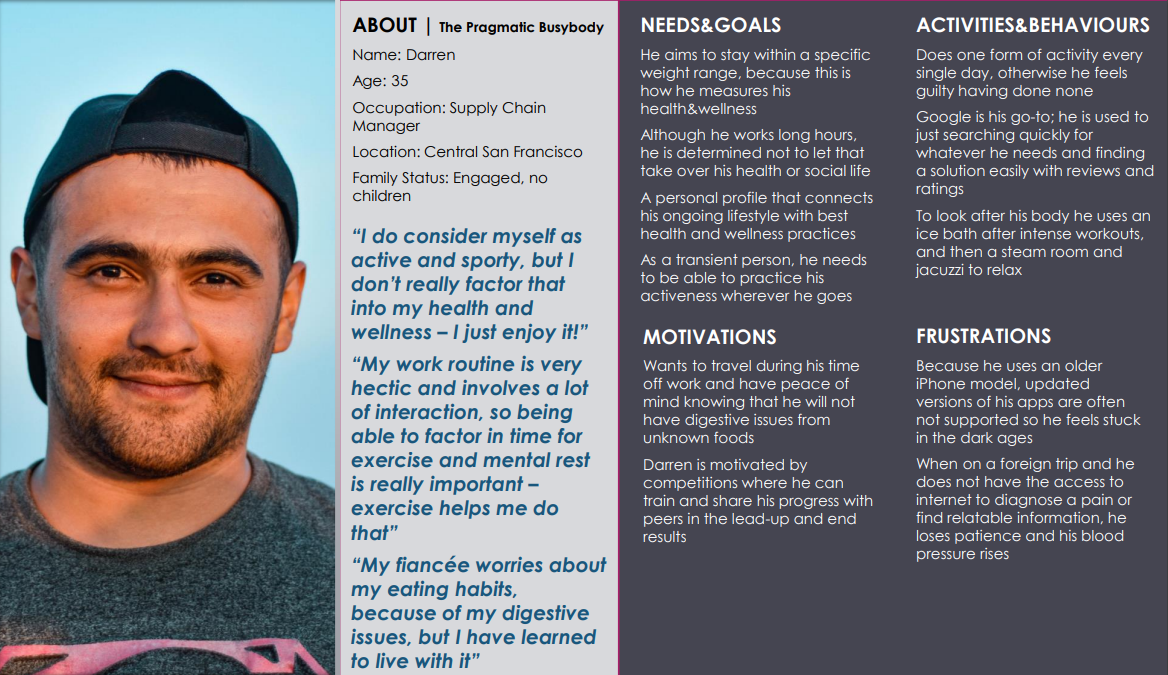
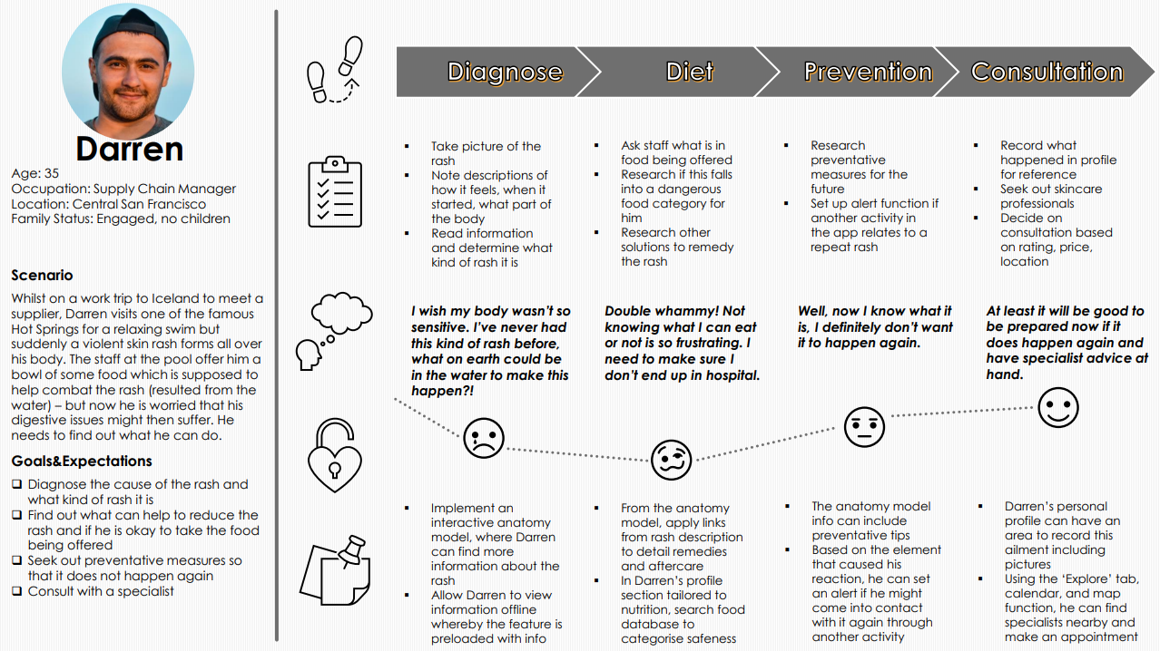
The Personas
& their Journeys
Having analysed the research so far, the insights gained gave way for action. Three user personas were developed, each to represent a different user demographic. It felt important to develop three so that in the ideation phase, the design of the app would keep focus on a varied audience.
Forming user journeys brought the three personas more to life and by imagining and detailing a real-life potential scenario for each person, it highlighted a lot of variables that should be accounted for in design.


The Information Architecture
After mapping out mental models and task flows of scenarios for my personas, and then using the analyses from a card sorting exercise through Optimal Sort, I had a better overview of the solutions that the app could provide and how these could be translated for drafting a sitemap. This was drawn using Lucidchart. The most significant finding at this point, was that featuring a calendar within the app proved not as necessary as originally hypothesised in the functional requirements. So this idea was scrapped.


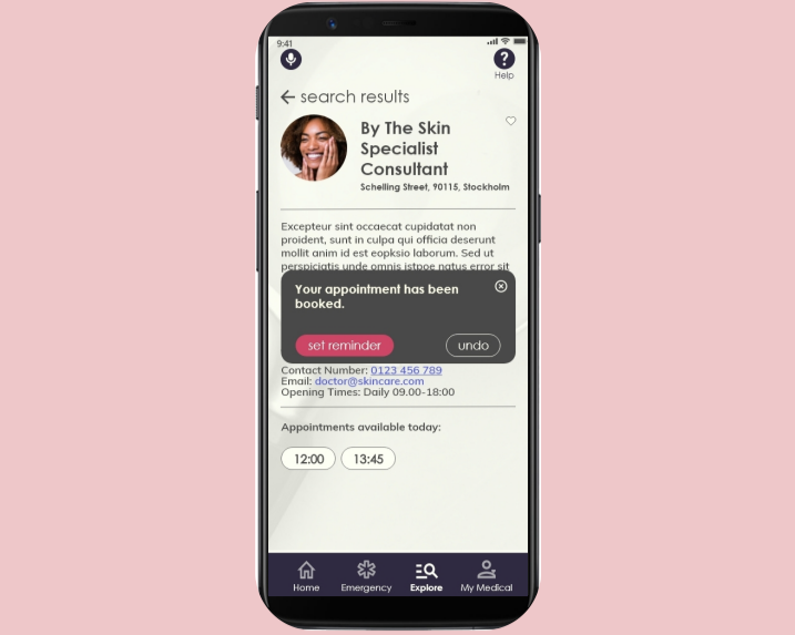
In the early ideation phase of wireframing, Low-Fidelity screens were drawn up with pen and paper, for both mobile and desktop, and focussed on three core features; an emergency/SOS button, adding health insurance information, and searching and filtering resources. These relate to the user scenarios previously plotted after conducting user research. The screens were later transformed to a digital Mid-Fidelity prototype using Balsamiq.
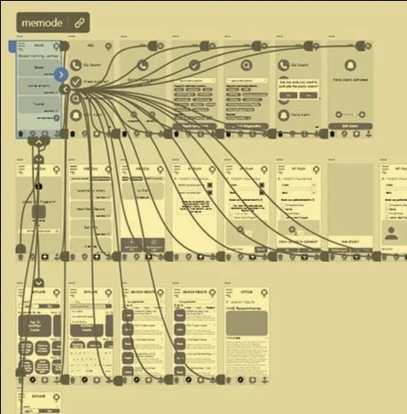
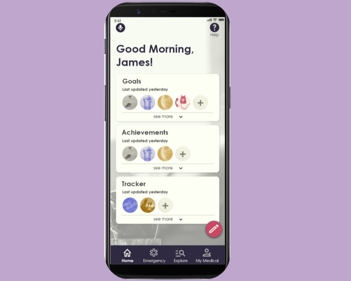
The Wireframes
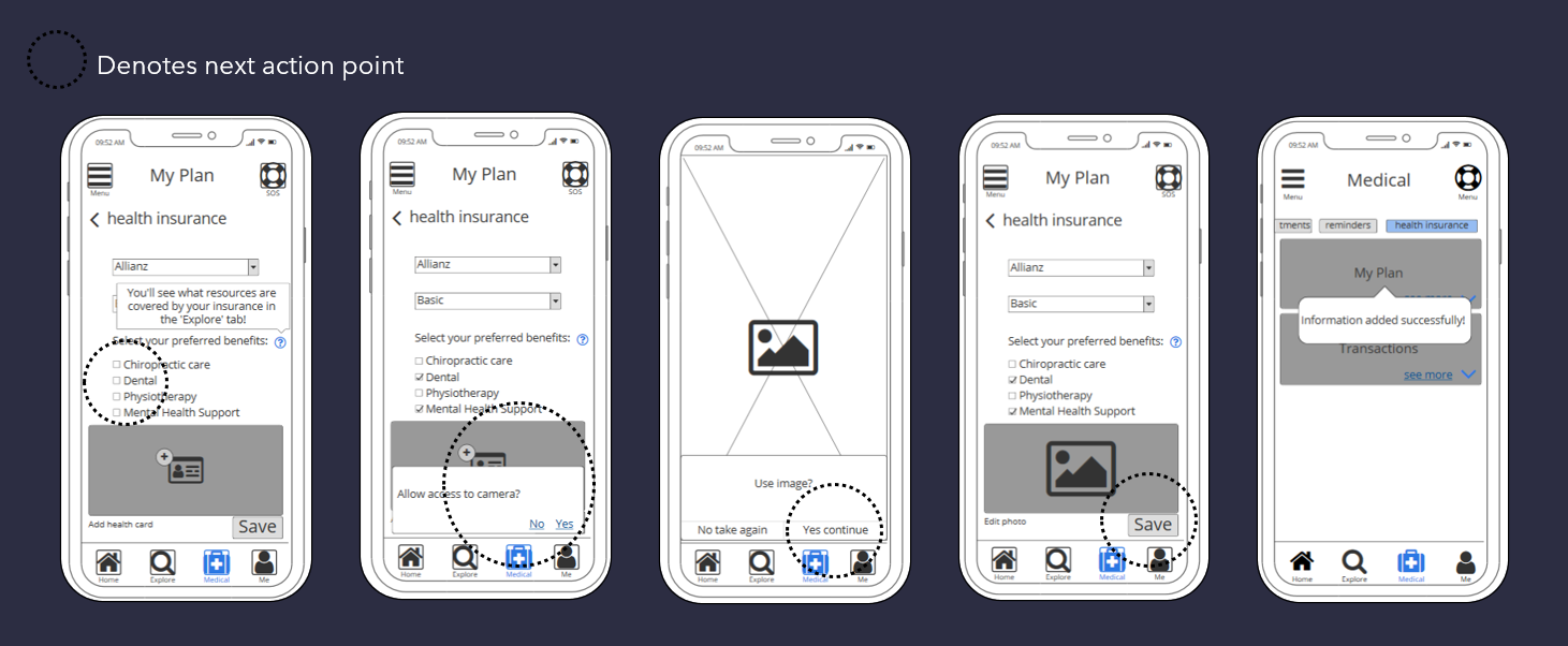
The Prototype
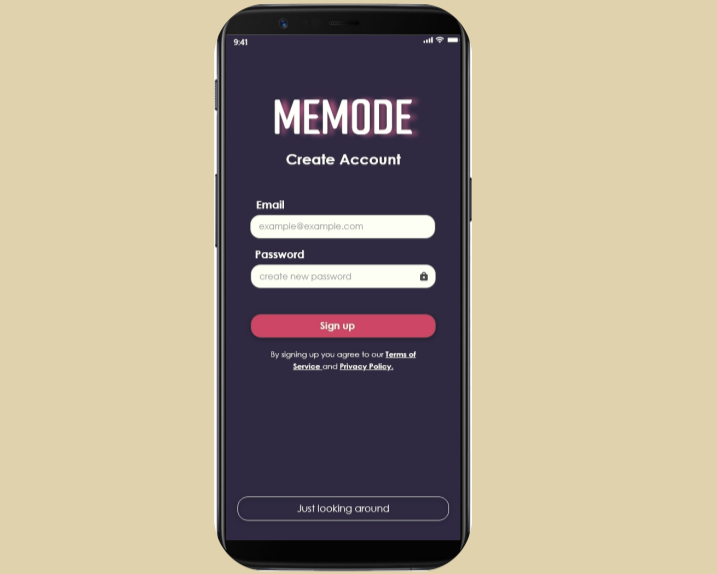
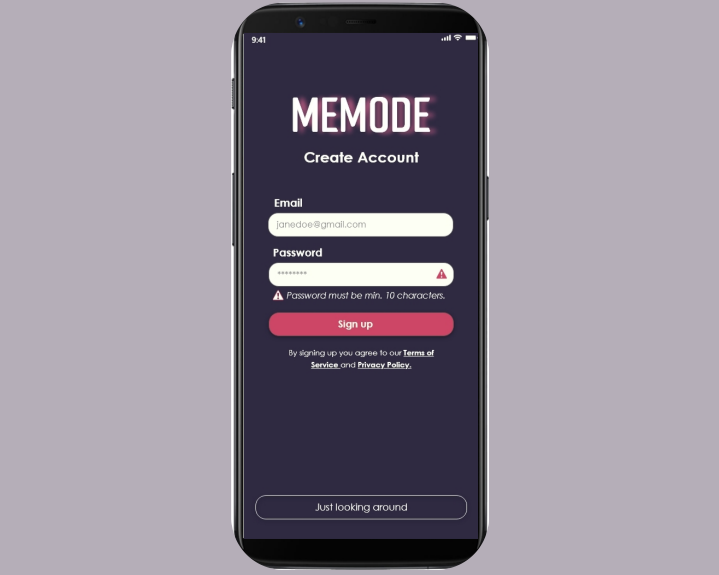
The principles of Usability Heuristics and Interaction Design led the app towards a High-Fidelity Prototype via Adobe XD that could then be tested. This is when the concept of memode was born, the idea being, that users can use memode to focus on themselves with the help of a personal health management experience.
The Usability Testing
After drafting a test plan and script that entailed 3 tasks, usability testing was carried out with 6 participants, from a wide demographic range. It was a mixture of remote moderated, and in-person moderated tests. I decided against unmoderated testing in this project to reduce time spent analysing results, to avoid participants potentially abandoning the study, to ensure participants did not seek help from others, and to emphasise to participants that their additional feedback and commentary is extremely important and valuable.
Additionally in further rapid prototyping, Preference Testing was conducted via Helio on one of memode’s onboarding screens to determine which the preferred design of 2 options provided.

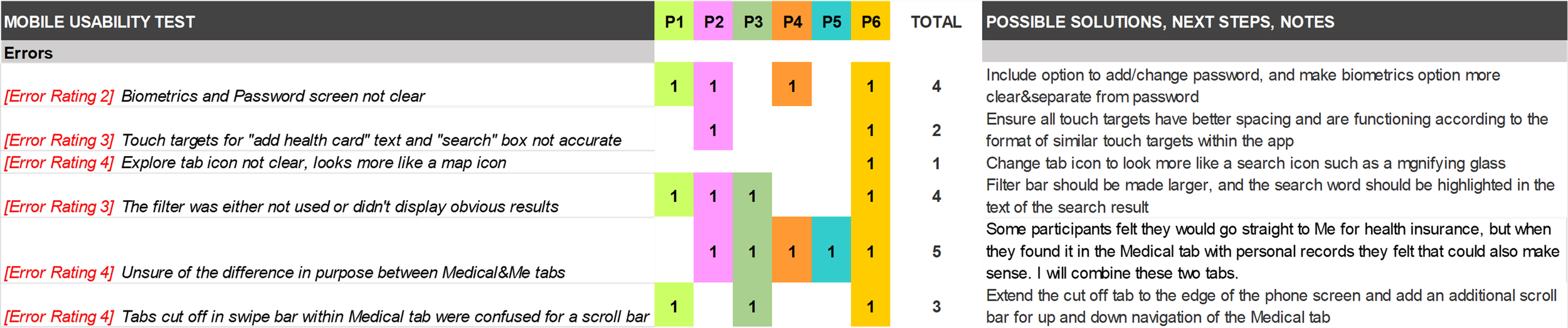
The Failures & Changes
The notes taken during usability testing were split into errors, observations, negative quotes and positive quotes, and categorised using Miro for affinity mapping. The categories were then classified on a rainbow spreadsheet, and rated against Jakob Nielson’s severity rating scale. This determined the issues that required most attention moving forward. Coming away from the usability testing, it was clear that many of the icons used in the main navigation tabs were either confusing or misleading. Other items like filters and horizontal tabs could be optimised to allow users a smoother flow through actions. After completing a post test report, and highlighting 5 issues that were most prevalent ranging from medium to high severity, I made improvements. Further iterations involved factoring in Emotional Design, applying Material Design Guidelines, Gestalt Design Principles, and design for Accessibility.
The Learnings
About the users
Every research participant proved very different and offered varying insights, but it was clear that when considering personal information such as medical history, security is key for all.
In most cases, people want to use products that are very simple, but at the same time that offer plenty of options and even more than they expect. Suggestions are welcome, as long as they’re relevant.
About the product
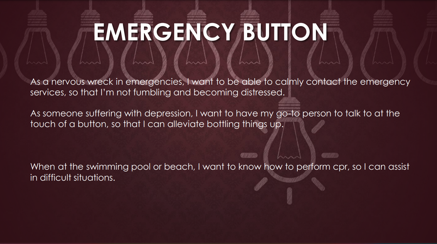
An emergency SOS button proved to be a hit! The majority of research participants said they could imagine it being useful in their lives.
The idea of a built-in medical section where people could select very specific health conditions proved that a massive amount of pre-loaded and very technical data is needed for this to be successful. This would require much more medical expertise than I possess!
About the process
As much as I had planned to focus on customisation in the app, I found myself straying from working on these components more closely, perhaps distracted by other areas to work on, or perhaps realising that it was more of a mammoth task. I still believe by focussing more on this aspect, that users would have a better connection to the app and want to use it.
The more notes the better!
It is important to remain really impartial to the user responses and try not to react - even when it is a topic I could personally relate to - but instead to build on responses where possible and dig a little deeper.